Build your team’s tech skills for real business impact
More than 5,000 companies count on our digital courses and more to guide their teams through the tools and technologies that drive business outcomes. We can help yours too.
New AI policy for O’Reilly authors and talent
O’Reilly president Laura Baldwin shares the company’s ethical approach to leveraging GenAI tools and ensuring O’Reilly experts are compensated for their work.
See it nowIt’s time to upskill your teams to leverage generative AI
LLMs aren’t the future of work, they’re the now. Every employee needs to learn how to leverage large language models for your organization to stay ahead. Fortunately, O’Reilly has all the resources your team needs.
Learn moreSee why Jose is on O’Reilly almost every day
Jose, a principal software engineer, trusts our learning platform to filter what his teams need to know to stay ahead.
See why Addison loves our learning platform
Addison always appreciated O’Reilly books, but the learning platform helped take her skills to the next level.
Amir trusts O’Reilly to find the answers he needs. See why.
For over eight years Amir has counted on our learning platform whether he needs proven methods to learn new technologies or the latest management tips.
Mark’s been an O’Reilly member for 13 years. See why.
Mark credits the O’Reilly learning platform with helping him to stay ahead at every turn throughout his tech career.

The 2023 O’Reilly Awards winners are in!
Learn who best put the O’Reilly learning platform to work for their organization and what the judges were looking for in winning submissions.
Sharing the knowledge of innovators for over 40 years
From books to leading tech conferences to a groundbreaking online learning platform, we’ve focused on creating the best technical learning content for more than four decades. Your teams can benefit from that experience.
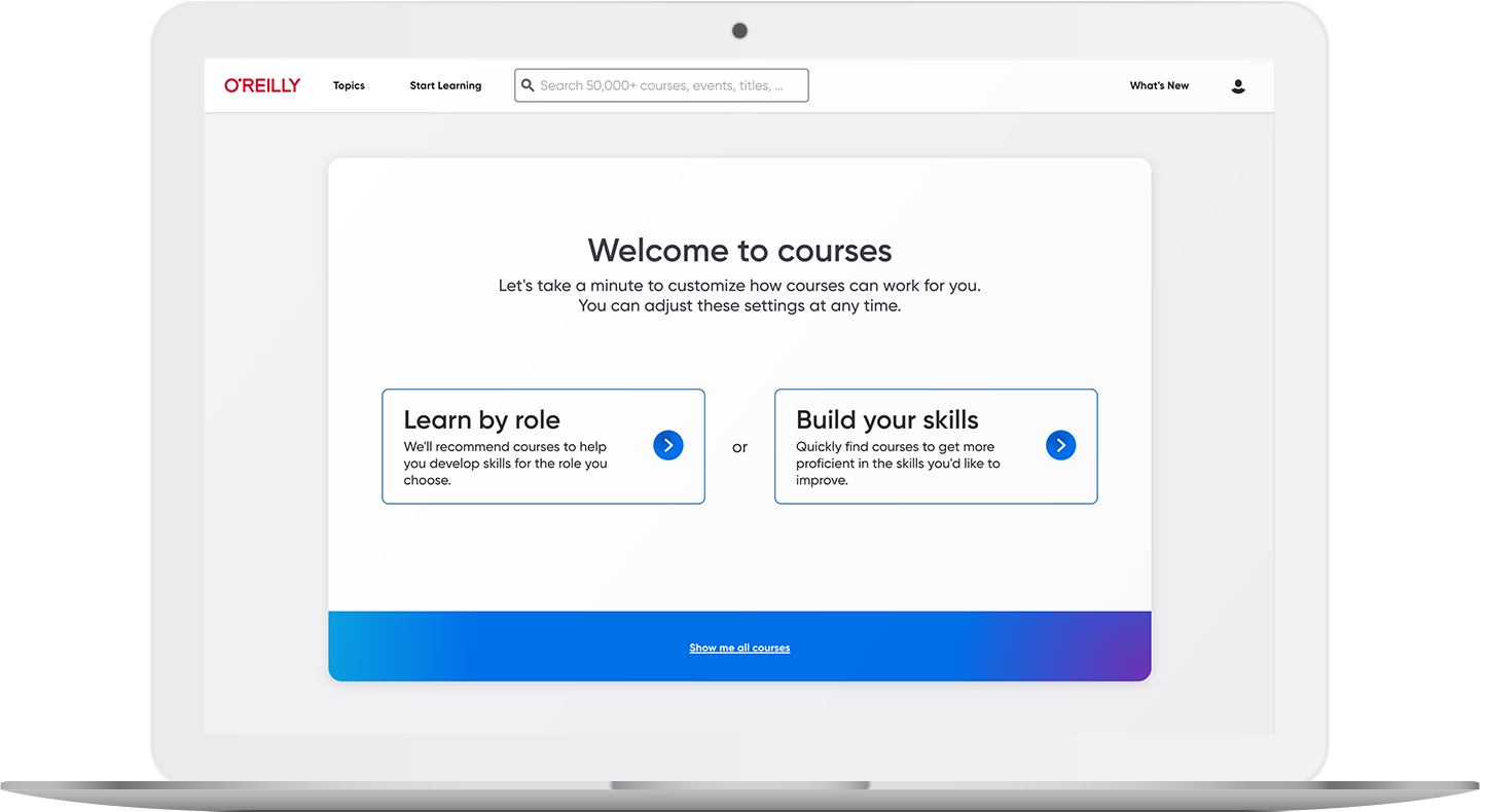
5,000+ courses to keep teams on the right path
Our live and on-demand courses are organized by skill and role, so your teams can easily find exactly what they need to succeed. Plus, they’ll earn verifiable and shareable badges that use the Open Badge 2.0 standard to show off what they’ve learned.
Explore coursesLive events keep your organization ahead of what’s next
Your teams have access to nearly 1,000 live online courses and events every year, led by top experts in AI, software architecture, cloud, data, programming, and more. And they can ask questions along the way.

Kai Holnes, Thoughtworks
Certified teams are teams you can count on
A certification means you can trust they’ve mastered the skills your organization needs. We help your people prep for their exams with direct paths to the official materials and interactive practice tests.
Help prove their proficiency